

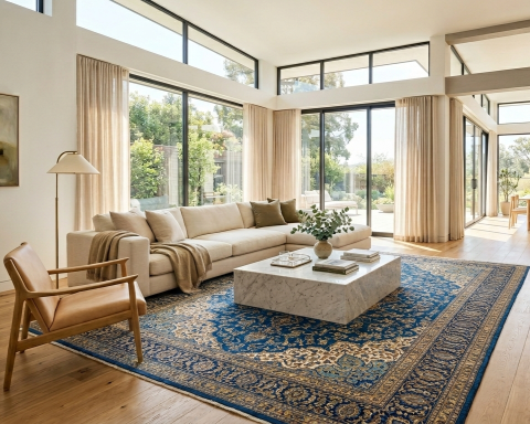
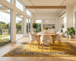
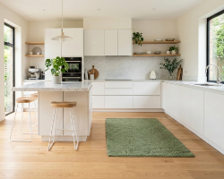
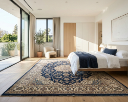
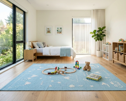
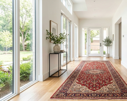
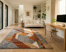
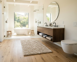



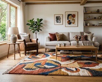

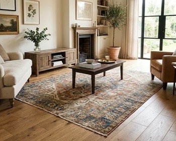
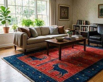
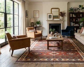
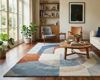

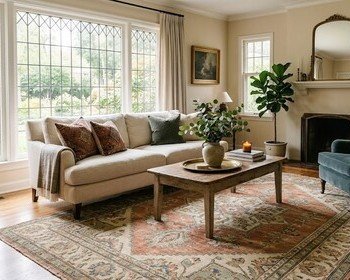
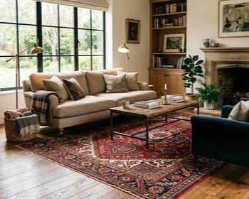
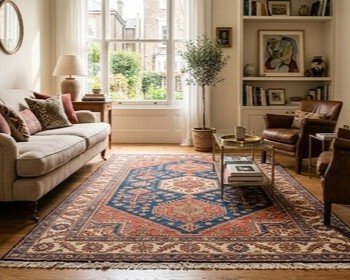
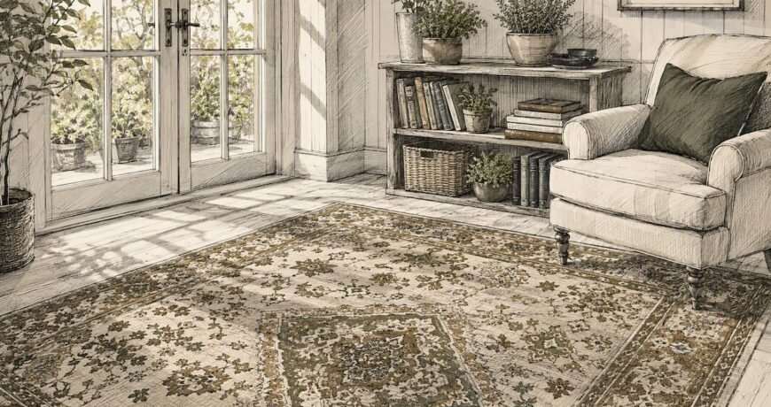
Blue rugs calm a room. Red and orange ones energize it. Greens restore, yellows lift, and neutrals like beige, ivory, and gray give you the flexibility to do almost anything. That’s the short version of rug color psychology, and it holds up across living rooms, bedrooms, and offices alike. Research summarized by design sources estimates that 62%–90% of a person’s first impression of a space comes from color alone, formed within roughly 90 seconds. The 60-30-10 rule puts rugs squarely in the 30% slot, meaning your rug color carries more visual weight than most people realize.
- Blue: calm, focus, trust
- Green: restorative, creative, grounding
- Red/orange: energizing, social, appetite-stimulating
- Yellow (muted): uplifting, creative — avoid saturated tones in large areas
- Beige/ivory/gray: flexible, neutral, grounding
Your first step: order two or three swatches from Rugsonlinemarket, place them in the actual room, and photograph them under morning light, afternoon sun, and evening lamps before committing.
Key Takeaways
Rug color psychology works when you match color to the room’s function, test under real lighting, and check undertones before buying.
| Point | Details |
|---|---|
| Color drives first impressions | Up to 90% of a room’s first impression comes from color, so rug choice carries real weight. |
| Match color to room function | Blue and green calm; red and orange energize; neutrals flex across any palette. |
| Test swatches in-room | Order multiple swatches and photograph them at different times of day before deciding. |
| Check undertones, not just hue | Mismatched undertones create visual tension even when the colors seem to go together. |
| Rugsonlinemarket | Browse by color family, order swatches, and return within 30 days if the color doesn’t work. |
Table of Contents
- How does rug color psychology actually work?
- Room-by-room rug color guide
- How tone, pattern, and material shift what a color does
- How to pair a rug color with your existing room
- How lighting changes what your rug color looks like
- Step-by-step process to pick and test a rug color
- Why trust these recommendations
- How seasons shift the mood your rug creates
- What most people get wrong about rug color
- Rugsonlinemarket makes color testing low-risk
- Sources
How does rug color psychology actually work?
Hue, saturation, and brightness (called value) are the three variables that determine how a color feels in a room. Hue is the color family: blue, red, green. Saturation is its intensity — a vivid cobalt versus a dusty slate. Value is how light or dark it reads. Low saturation tends to calm; high saturation energizes. Dark values feel grounding and cozy; pale values open a space up.
Warm colors (reds, oranges, yellows) raise perceived temperature and energy. Cool colors (blues, greens, violets) lower it. This isn’t purely psychological — warm hues can literally make a room feel a few degrees warmer, which matters in north-facing rooms that get little direct sun.
Pro Tip: Undertones are where most buyers go wrong. A beige rug with a pink undertone will clash with warm-toned oak floors, even though “beige” sounds safe. Match undertones across walls, sofa, and rug — testing samples in the actual room is the only reliable way to catch a mismatch before you buy.
Room-by-room rug color guide
| Room | Recommended color families | Mood effect |
|---|---|---|
| Living room | Warm neutrals, terracotta, deep blue | Welcoming, social, grounded |
| Bedroom | Soft blue, muted green, lavender | Calm, restful, sleep-supporting |
| Dining room | Warm red, burgundy, amber | Appetite-stimulating, convivial |
| Kitchen | Cream, sage, soft yellow | Fresh, clean, energizing |
| Entry/hallway | Charcoal, navy, bold pattern | Confident first impression |
| Kids’ room | Soft teal, warm yellow, multi-color | Playful, stimulating, imaginative |
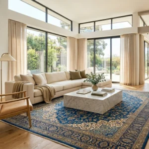
Living room: A warm neutral or a deep blue rug anchors seating and signals “settle in.” Avoid very pale rugs in high-traffic areas — they show wear fast.
Bedroom: Cool blues and muted greens are consistently linked to lower heart rate and easier sleep onset. Stick to low-saturation versions; a vivid teal reads as energizing, not restful.
Dining room: Red and burgundy rugs have a long track record in hospitality design for a reason — warm hues stimulate conversation and appetite. Pattern helps hide food spills, which is a practical bonus.
Entry: This is the room’s handshake. A bold, dark rug signals confidence and hides dirt. A runner in charcoal or navy works well in narrow halls; see the runner rug collection for proportional options.
How tone, pattern, and material shift what a color does
The same dye looks different on wool versus silk. Silk’s sheen amplifies saturation — a muted blue becomes jewel-like. Wool absorbs light and reads warmer, grounding the same color. Material sheen changes perceived vibrancy, which is why designers often use silk accents for brilliance and wool fields for warmth in the same rug.

| Material | Mood effect | Durability | Care notes |
|---|---|---|---|
| Wool | Warm, grounded, rich | High | Vacuum regularly; spot-clean |
| Silk | Luminous, formal, vibrant | Low-medium | Dry clean; avoid high traffic |
| Cotton | Fresh, casual, light | Medium | Machine washable (many styles) |
| Synthetic | Consistent, bright, even | High | Easy to clean; stain-resistant |
| Natural fiber (jute/sisal) | Earthy, organic, textural | Medium | Avoid moisture; vacuum only |
Pattern scale matters just as much as color. A large, bold geometric pattern reads as dynamic and modern — it can make a neutral color feel energetic. Small, low-contrast patterns recede and feel subtle, letting the color do the work quietly. Natural fiber rugs in jute or sisal add organic texture that reads as warm even in pale tones.
Maintenance callout: Light-colored rugs show stains more visibly. If the room gets heavy use, choose a mid-tone or patterned rug — the pattern breaks up any marks and the color stays looking intentional longer.
How to pair a rug color with your existing room
Start with your wall color as the anchor. Walls cover the most surface area, so they set the room’s dominant temperature. Then consider your sofa — it’s usually the largest movable object. The rug should relate to both without copying either.
Three rules that hold up in practice:
- Pick up an accent color. If your sofa has a throw pillow in terracotta, a rug with warm amber or rust tones creates cohesion without matching exactly.
- Use contrast to define the zone. A light rug on dark floors, or a dark rug on pale floors, draws the eye and anchors the seating area clearly.
- Avoid exact matches. A rug that perfectly matches the sofa makes the room feel flat. Tonal layering (same color family, different values) works; identical color does not.
A rug can anchor the palette, introduce an accent, or act as a neutral foundation — decide which role it plays before you choose a color, because that decision changes everything.
Cultural context matters here too. Red signals luck and prosperity in many Asian traditions, while in Western interiors it reads as bold and social. Blue carries trust in Western office design but represents solitude or power in traditional Persian symbolism. If you’re designing a shared or hospitality space, those associations are worth factoring in.
Pro Tip: Check undertones with a white sheet of paper. Hold it next to your wall paint, then next to your rug swatch. If both have a yellow undertone, they’ll harmonize. If one pulls pink and the other pulls green, you’ll feel the tension even if you can’t name it.
How lighting changes what your rug color looks like
Light temperature rewrites color. A warm incandescent or Edison bulb pulls yellow into a beige rug and deepens a red. A cool LED flattens warm tones and makes blues feel crisper. Natural daylight shifts through the day — morning light is cooler and bluer; afternoon light is warmer and more golden.
Testing checklist before you commit:
- View the swatch at 8 AM, noon, and 8 PM
- Check it under your overhead fixture and a side lamp
- Photograph it with your phone’s auto white balance, then with flash off
- Hold it against the sofa fabric and the floor in the same shot
North-facing rooms stay cool and shadowed all day, which makes warm-toned rugs (terracotta, amber, warm ivory) a smart counterbalance. South-facing rooms get strong, shifting light — they can handle cooler blues and greens without feeling cold.
Pro Tip: For the most accurate swatch photo, turn off flash, set your phone to “auto” white balance, and shoot in the middle of the day with the overhead light on. That combination shows the rug closest to how guests will see it.
Step-by-step process to pick and test a rug color
- Define the mood you want the room to produce: calm, energizing, cozy, formal.
- Shortlist two or three color families based on the room-by-room guide above.
- Order swatches — two or three options, not one. Single-swatch decisions are how buyer’s remorse happens.
- Test in situ for at least 48 hours, across different lighting conditions.
- Photograph each swatch against the floor, sofa, and wall in the same frame.
- Finalize size and pattern once color is confirmed — size affects how much color reads in the room.
- Check return and shipping policies before ordering the full rug.
When to go bold versus neutral: choose a bold color if the room has fixed neutral walls and floors and you want the rug as the statement. Choose a neutral if walls or furniture are already strong, or if you plan to change decor seasonally. Rugsonlinemarket’s rug size and color guide walks through both scenarios in detail.
Rugsonlinemarket offers free shipping on orders over $300 and 30-day hassle-free returns, which makes in-home testing genuinely low-risk.
Why trust these recommendations
These recommendations draw on established color psychology research, traditional rug design history, and practical in-room testing methods. Kian, who authors rug selection guides for Rugsonlinemarket including the size and color guide, grounds recommendations in both design standards and real buyer outcomes.
Rugsonlinemarket’s trust signals:
- Free shipping on orders over $300
- 30-day hassle-free returns
- 100% feedback guarantee
- Swatch and sample ordering available through rug services
How seasons shift the mood your rug creates
Rug color isn’t a one-and-done decision. The same room feels different in January than in July, and a rug that felt cozy in winter can feel heavy by May.
Lighter colors — soft ivory, pale sage, warm white — reflect more light and make a room feel airier in summer. Darker, richer tones — deep teal, burgundy, charcoal — absorb light and add the visual weight that makes a room feel warm when days are short. Many designers keep a neutral rug as the year-round base and rotate accent throws and cushions seasonally, but swapping a runner or a smaller accent rug is a lower-cost way to shift the room’s mood with the season. Neutral rugs are particularly useful here — they hold their own in summer and accept darker accessories in winter without fighting either.
What most people get wrong about rug color
Most buyers focus on whether they like a color in isolation. The smarter question is whether the color does the job the room needs. A bedroom doesn’t need a rug you love in the store — it needs one that makes you feel calm at 10 PM when the lights are low. A dining room doesn’t need a subtle, sophisticated neutral — it needs something warm enough to make people want to linger.
The other thing worth saying plainly: traditional Persian and Oriental rug colors carry centuries of symbolic weight — green for renewal, red for joy, blue for power. That history isn’t just trivia. It’s part of why certain color combinations in antique rugs feel so resolved. When a modern rug feels “off” despite looking fine on paper, it’s often because the color relationships weren’t built with that kind of intention. Reading a rug’s design history can reframe how you evaluate any rug, traditional or contemporary.
Rugsonlinemarket makes color testing low-risk
Choosing a rug color is easier when you can test it in your actual room before committing. Rugsonlinemarket’s collection spans every color family — from blue rugs for calm spaces to red and burgundy for social rooms — with natural fiber options in wool, silk, and jute for readers who want material and color working together.
Browse by color family at Rugsonlinemarket’s color hub, or start with the shop to filter by room and mood. Order two or three options, live with them for a few days, and let the room tell you which one works.
Sources
- How to Pick a Rug Color For Living Room: By Wall Color and Sofa – Painting Tips
- How Rug Colors Influence Mood and Interior Design – Boo & Maddie
- Rug Color Meanings On Persian Area Rugs – Oriental Rug Salon
- Rug Colors and Psychology: How Shades Shape Mood and Design – Seraj Rugs
